

Open the “Analytics” section of your dashboard
There you can see how your quizzes perform based on visits and leads, without connecting any external tools.
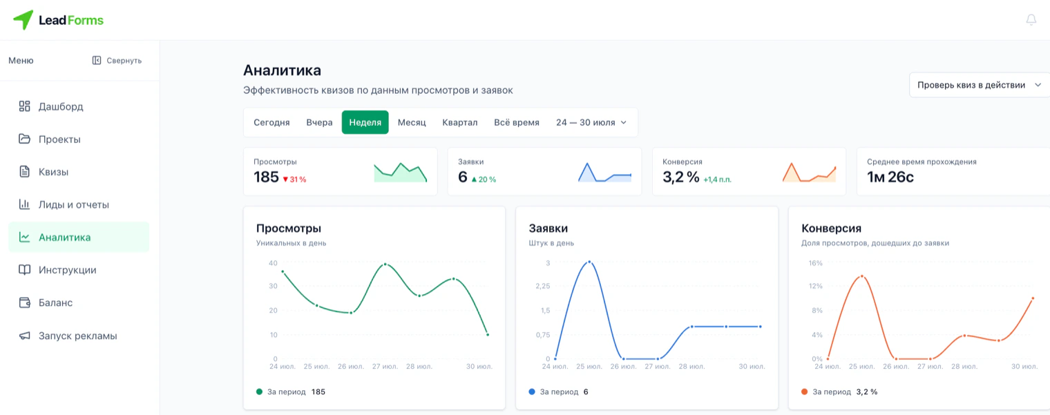
The four metrics at the top
• Visits: how many unique people opened the quiz;
• Leads: how many of them left their details;
• Conversion: what share of visits turned into a lead;
• Average time: how long it takes each person to complete the quiz.
Next to each metric you see the change from the previous period and a mini chart, so you can spot the trend at a glance.
• Leads: how many of them left their details;
• Conversion: what share of visits turned into a lead;
• Average time: how long it takes each person to complete the quiz.
Next to each metric you see the change from the previous period and a mini chart, so you can spot the trend at a glance.
Daily charts
Visits, leads and conversion broken down by day for the selected period. This shows on which days the quiz worked best and on which days there was traffic but no leads.
“Where people drop off”: the step-by-step report
It shows how many people reached each question and how many left right there. This is the most useful report: it does not tell you “conversion is low”, it tells you exactly which question makes people close the quiz.
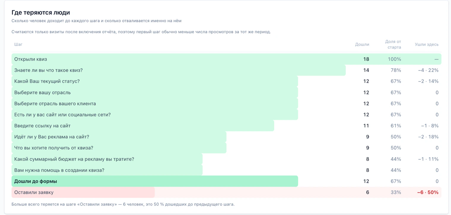
How to read the three columns
• Reached: how many people got to that step.
• Percent of start: what percentage that is of the people who opened the quiz. The first row is always 100%.
• Left here: how many people closed the quiz at that step, and what share that is of those who reached the previous one.
The green bar is proportional to the number of people who reached the step, so a sharp drop is visible instantly without reading the numbers. At the bottom there are two separate rows, “Reached the form” and “Left their details”: most of the loss usually happens between those two.
• Percent of start: what percentage that is of the people who opened the quiz. The first row is always 100%.
• Left here: how many people closed the quiz at that step, and what share that is of those who reached the previous one.
The green bar is proportional to the number of people who reached the step, so a sharp drop is visible instantly without reading the numbers. At the bottom there are two separate rows, “Reached the form” and “Left their details”: most of the loss usually happens between those two.
What to do about it
Below the table, the most problematic step is highlighted: start there. If people leave at a specific question, it is usually too personal, unclear or asked too early. Try rewording it, making it optional or moving it closer to the end.
Look separately at the jump from “Reached the form” to “Left their details”. A big loss there means people got there but did not want to share their details: it usually helps to cut the number of fields or explain what they will get when they submit.
Look separately at the jump from “Reached the form” to “Left their details”. A big loss there means people got there but did not want to share their details: it usually helps to cut the number of fields or explain what they will get when they submit.
A note on counting
The report only counts visits after it was turned on, so the number for the first step is usually lower than the visits for the same period. Comparing those two numbers makes no sense.
“Traffic sources” and “Device type”
Two reports that show where people came from and what they opened the quiz on. What matters is not the pie chart but the lead conversion lines below it: they show which traffic and which devices actually bring leads.
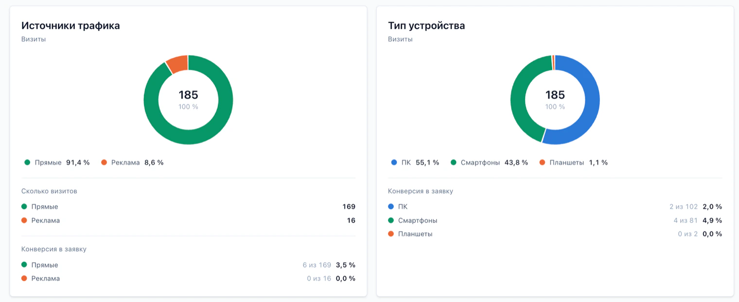
How to read it
The ring shows each group's share of visits, with the total for the period in the center. Below are the same groups in absolute numbers and, in the conversion block, how many left their details: first “how many out of how many”, then the percentage.
Look at both numbers together. A source can bring many visits and zero leads: there is traffic, but it is useless. And the other way around, a small group with high conversion is often the most valuable.
Look at both numbers together. A source can bring many visits and zero leads: there is traffic, but it is useless. And the other way around, a small group with high conversion is often the most valuable.
What to do about it
• If ads bring visits but no leads, the problem is usually between the ad and the quiz: people expected one thing and found another.
• If phones convert much worse than computers, open the quiz on your phone and take it yourself: what usually gets in the way is long questions, small buttons and heavy images.
• Groups with two or three visits, such as tablets, tell you nothing: with numbers like that, the percentage is pure chance and you should not draw conclusions.
• If phones convert much worse than computers, open the quiz on your phone and take it yourself: what usually gets in the way is long questions, small buttons and heavy images.
• Groups with two or three visits, such as tablets, tell you nothing: with numbers like that, the percentage is pure chance and you should not draw conclusions.
“When leads come in”: time and duration
This report answers two practical questions: when the most leads come in, that is, when it is best to call people back, and how much time people spend on the quiz.
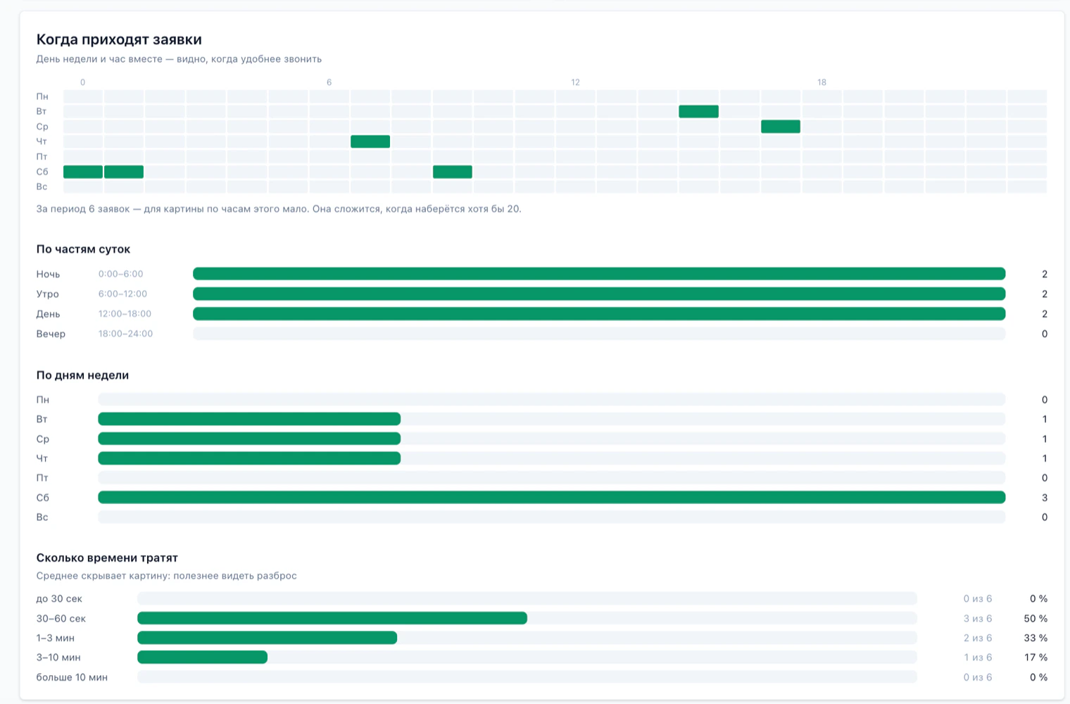
Day-by-hour map
At the top is a grid of day of the week by hour: the darker a cell, the more leads came in at that time. So you know not just that Tuesday is busy, but that Tuesday around noon is.
Below the grid you see the total number of leads. While there are only a few, the map will look almost empty, and that is normal: the pattern shows up at around 20 leads. Until then, go by the two summaries below.
Below the grid you see the total number of leads. While there are only a few, the map will look almost empty, and that is normal: the pattern shows up at around 20 leads. Until then, go by the two summaries below.
By time of day and day of the week
The same leads in larger groups: night, morning, afternoon and evening, and separately by day of the week. With little data, these two summaries are more reliable than the hourly map, because they split leads into four and seven groups instead of 168 cells.
The practical takeaway is simple: where the bars are longest, that is when to schedule your calls.
The practical takeaway is simple: where the bars are longest, that is when to schedule your calls.
“How much time they spend”
Leads are grouped by completion time: under 30 seconds, 30 to 60 seconds, 1 to 3 minutes, 3 to 10 minutes and over 10 minutes. Next to each group you see how many leads fell into it and what share they make up.
The spread tells you more than the average: an average of one minute can mean everyone takes a minute, or that half took 30 seconds and the other half three minutes. Many leads in the extreme groups are a reason to take a closer look: people answer too fast when there are few questions and they are shallow, and too slowly when a question is unclear or makes them look something up.
The spread tells you more than the average: an average of one minute can mean everyone takes a minute, or that half took 30 seconds and the other half three minutes. Many leads in the extreme groups are a reason to take a closer look: people answer too fast when there are few questions and they are shallow, and too slowly when a question is unclear or makes them look something up.
Filters by quiz and by period
At the top right you choose the quiz: one specific quiz or all of them at once. The period is set with the buttons for today, yesterday, week, month, quarter and all time, or with your own dates.
Still have questions?
If something is unclear, and we will sort it out with you.
